Website Strategy9 min read
Builder Website Teardown: What the Best Sites in the Industry Get Right
A builder website teardown of the patterns top custom home builders share — full-bleed galleries, process timelines, video testimonials and clean navigation.
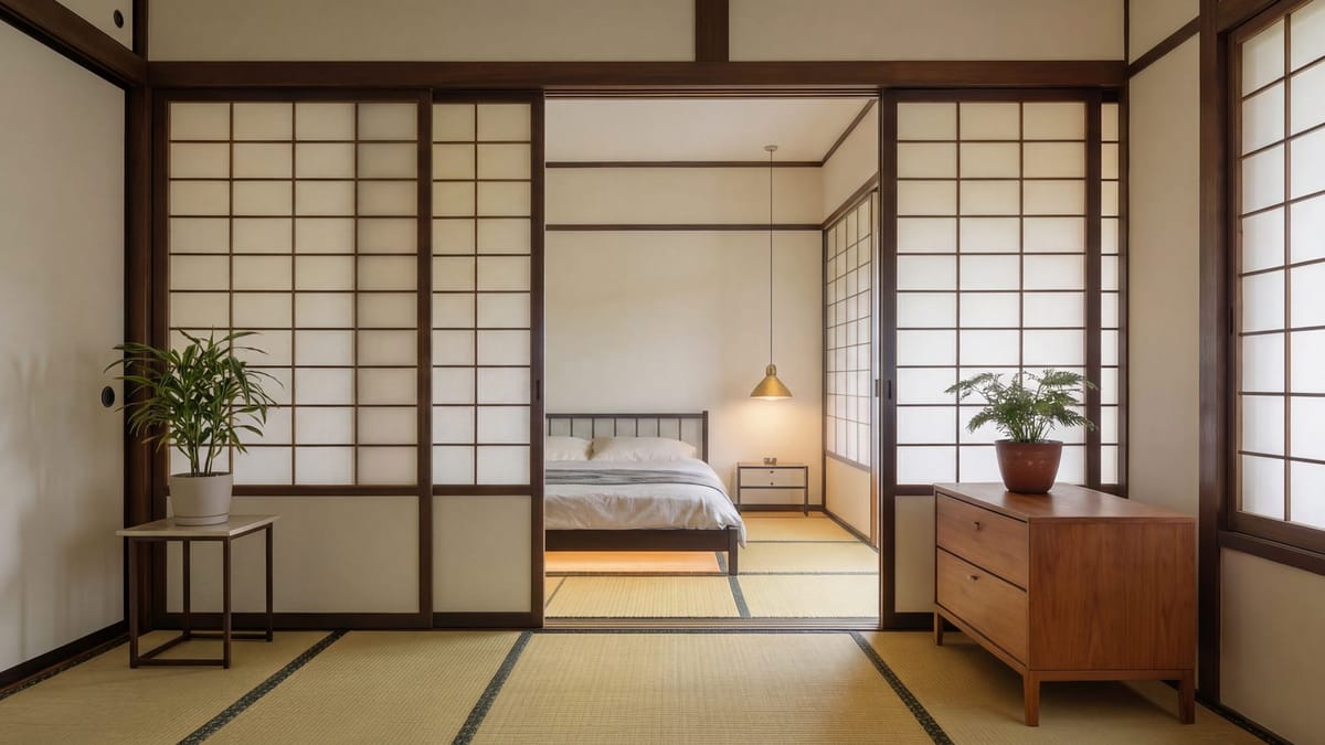
Spend an evening clicking through the websites of the most respected custom home builders in the country and something strange happens. They start to blur together — in a good way.
Different markets, different architectural styles, different price points. But the best sites keep making the same handful of decisions. Not the same colors or fonts. The same thinking.
We've looked at a lot of builder websites. This is a teardown of the patterns that show up again and again on the ones that work — what they do, why it works, and how to apply it to your own site. No names, no screenshots. Just the playbook.
Pattern 1: The work fills the screen
The first thing you notice on a top-tier builder site is how little is in your way.
There's no carousel of five rotating slides with text on top. No wall of badges. No "Welcome to our website!" headline. You land, and a single exceptional image — or a short, quiet video loop — fills the screen edge to edge. A finished home at dusk. A kitchen in morning light. One line of copy, maybe two.
Why it works
A custom home is a visual purchase. The fastest way to prove you build beautiful homes is to show one, big, immediately. Full-bleed imagery also signals confidence: you're not cramming in every selling point because you don't need to.
What it looks like on project pages
The pattern continues inside. The best project pages read more like a magazine feature than a photo album:
- A large hero image of the home.
- A short paragraph on the brief: who the clients were, what the site demanded, what they wanted to feel.
- Full-width images alternating with smaller detail shots.
- A few facts — location, size, style, architect — set in a quiet sidebar or caption.
- A clear next step at the end, not a dead end.
Compare that to the typical pattern: a grid of identical thumbnails that open into a lightbox with no context. One tells a story. The other is a filing cabinet.
Steal this
Pick your single best photograph and make it your homepage hero, full width, with one short line about what you build and where. Then rebuild your top three project pages as stories, not galleries. For the full approach, see how a project portfolio turns browsers into buyers.
Pattern 2: The process is a visible timeline
Average builder sites say "we offer a seamless, client-focused experience." The best builder sites show the experience, step by step.
You'll usually find a dedicated "Our Process" or "How We Work" page — often linked right from the main navigation — laid out as a numbered timeline. Something like:
- Introduction. A first conversation about the lot, the vision and the budget range.
- Preconstruction. Design coordination, estimating, value engineering, scheduling.
- Selections. Guided choices on finishes and fixtures, with allowances tracked.
- Construction. Regular updates, site walks and a single point of contact.
- Handover and warranty. Walkthroughs, documentation and support after move-in.
Each stage gets a short paragraph explaining what happens, who's involved and what the client is responsible for. The best versions add rough durations for each phase, and some include a photo from that stage of a real project.
Why it works
The biggest fear for a high-end client isn't the house. It's the process — surprises, silence, spiraling costs. A clear timeline turns an anxious unknown into a plan they can picture. It also pre-qualifies: clients who value structure lean in, and clients who just want the cheapest number tend to self-select out.
Steal this
Write down how a project actually moves through your company, in four to six stages. Give each one a plain-English name and two or three sentences. Put it on its own page and link to it from your homepage. You don't need a designer to get the substance right — just honesty and clarity.
Pattern 3: Clients speak for you — on camera
Nearly every builder site has testimonials. The best ones treat them completely differently.
Instead of a slider of anonymous quotes ("Great experience! — J.S."), the strongest sites feature short video testimonials from real homeowners, filmed in the finished home. Often just a minute or two. The client talks about why they chose the builder, what the process felt like, and what surprised them — while the camera shows the space behind them.
Where video isn't available, the written testimonials are specific: full names (with permission), the type of project, the location, and quotes that describe something concrete — how a problem was handled, how communication worked, how the budget was managed.
Why it works
Written praise is easy to dismiss. Video is hard to fake. A prospective client hears a real person's voice, sees the real home and recognizes someone like themselves. That's the most persuasive thing a builder website can offer — and it's the thing most sites lack.
Placement matters too. The best sites don't banish testimonials to a separate page nobody visits. They place them where doubt peaks: on project pages, next to the process timeline and near the contact form.
Steal this
At your next handover, ask the homeowners if they'd be willing to share a few minutes on camera. Keep it simple: one person, natural light, a few prompts. Then put the clip on that project's page. And make sure the same goodwill shows up where people search for you — see how to get more Google reviews as a builder.
Pattern 4: Navigation that gets out of the way
Open the menu on a top builder site and you'll usually find fewer items than you expect. Often five or six:
- Projects (or Portfolio)
- Process
- About (or Team)
- Journal (or Insights)
- Contact
That's it. No dropdowns six levels deep. No separate pages for every service you've ever offered. No "Resources" menu hiding three PDFs from years ago.
On phones, the menu is clean and thumb-friendly, the phone number is tappable and a "Start a conversation" or "Contact" button is always within reach.
Why it works
Every extra menu item is a decision you're asking a visitor to make. Premium buyers don't want to work for information. Clean navigation tells them you've thought about their experience — which is exactly what they're hoping you'll do with their home.
It also helps search engines and AI tools understand your site. A clear structure, with each page doing one job, is easier to crawl, index and summarize. That's part of how builders are getting found on ChatGPT and AI search.
Steal this
List every item in your current menu. For each one, ask: would a prospective client miss it if it were gone? Merge, cut or move what's left into the footer. Then make sure your contact button is visible on every page, on every screen size.
The quieter patterns
Beyond the big four, the best builder sites share a few details that are easy to miss but add up:
- They're fast. Big images, but properly compressed. Google's guidance is for the main content of a page to load within 2.5 seconds, and the best builder sites take that seriously even with heavy photography.
- They're specific about where they build. Named towns, neighborhoods and counties — not just "the greater metro area."
- They're current. Recent projects, recent articles, nothing that screams "last updated years ago."
- They ask for little. Short contact forms, often name, email and phone, with a clear note about what happens next.
- They sound human. Copy written in plain language, often in the founder's voice, without "quality craftsmanship" clichés.
What the best sites don't do
Sometimes the clearest lessons are in what's missing. On the strongest builder sites, you rarely see:
- Stock photography of hard hats, handshakes or blueprints.
- Autoplaying music or video with sound.
- Pop-ups that appear before you've seen a single project.
- A long list of awards before any actual work.
- A homepage that tries to say everything at once.
Restraint is a design decision. The best builders make it on purpose.
How to run your own teardown
Here's a simple exercise. Open your website next to two or three builder sites you admire — ideally outside your market, so it's about craft, not competition. For each site, note:
- What you see in the first five seconds, without scrolling.
- How many clicks it takes to reach a full project story.
- Whether you can explain their process after one minute.
- Whether you hear directly from a past client.
- How easy it is to get in touch from your phone.
Then score your own site on the same five points. The gaps will be obvious, and they'll usually be fixable without starting from scratch. If you want a deeper diagnosis, start with why your builder website isn't getting leads.
The bottom line
The best builder websites aren't winning because they spent the most or used the trendiest design. They win because they make a few disciplined choices: let the work fill the screen, make the process visible, let clients speak and keep navigation simple.
None of that is out of reach for a builder of any size. It just takes deciding that your website deserves the same care you put into your homes.
See what these patterns look like applied to your own projects — request a free preview of your new site at gridandmark.com.
By Grid+Mark Teambuilder website · website design · custom home builders · web design best practices
Related articles
Website Strategy8 min read
How Long Should It Take to Launch a Builder Website?
How long does a builder website take to launch? DIY, custom agency builds and done-for-you platforms compared, plus the four things that set your timeline.
Website Strategy7 min read
Why Your Builder Website Isn't Getting You Leads (And What to Fix)
Most custom home builder websites look fine but generate zero inquiries. Here's what's actually going wrong — and the fixes that turn a digital brochure into a lead engine.
Website Strategy2 min read
How a Project Portfolio Turns Browsers into Buyers
Your portfolio is not a photo album. Structured the right way, it does the qualifying, the storytelling and the first sales conversation for you.